背景介绍
- 可视化可以分为静态/交互式两大类
- 数据分析需要查看图表的不同细节
- 交互式作图就有更好的视觉体验
- matplotlib/plotnine绘制静态图片、
plotly是Python交互式可视化库
- Altair
- Brokeh
- PyEcharts
- ...
Plotly简介
![]()
- Plotly.py,即
plotly库(https://plotly.com/python/ ) - 交互式、声明式高级绘图库
- 基于浏览器、plotly.js
- 支持科学、统计学、金融、地理、3D等领域图表
- 可能“Python绘图库中最全的 API 和最强大的交互工具”
Plotly生态
- 基础:plotly.js
- 核心:Plotly.py
- 封装:Plotly Express
- 云端:Chart Studio
- APP: Dash
- 第三方: Cufflinks
依赖安装
$ pip install plotly
# Jupyter Notebook Support
$ pip install "notebook>=5.3" "ipywidgets>=7.2"
# JupyterLab Support (Python 3.5+)
$ pip install jupyterlab "ipywidgets>=7.5"
# Static Image Export Support
$ conda install -c plotly plotly-orca==1.2.1 psutil requests
# Extended Geo Support
$ pip install plotly-geo==1.0.0
# cufflinks library
$ pip install cufflinks
# Chart Studio Support
$ pip install chart-studio==1.0.0
# Dash App Support
$ pip install dash==1.13.3导入设置
import plotly.graph_objects as go
import plotly.io as pio
import plotly
# pio.renderers.default = "notebook"
pio.templates.default = "plotly"
fig = go.Figure(layout=go.Layout(height=600, width=800,margin=dict(l=15, r=15, b=15, t=50)))
templated_fig = pio.to_templated(fig)
pio.templates['slide'] = templated_fig.layout.template
pio.templates.default = 'slide'
Plotly绘图机制
plotlyPython库创建、修改各种图表对象- 采用
dict或plotly.graph_objects.Figure保存图表信息 - 经过JSON序列化传递给
Plotly.js Plotly.js完成图表渲染
Plotly Figure构成
import plotly.graph_objects as go
fig = go.Figure(
data=[go.Bar(x=[1, 2, 3], y=[1, 3, 2])],
)
fig
fig.layout.template = None # to slim down the output
print("Dictionary Representation of A Graph Object:\n\n" + str(fig.to_dict()))
print("\n\n")
print("JSON Representation of A Graph Object:\n\n" + str(fig.to_json()))
print("\n\n")
Dictionary Representation of A Graph Object:
{'data': [{'x': [1, 2, 3], 'y': [1, 3, 2], 'type': 'bar'}], 'layout': {}}
JSON Representation of A Graph Object:
{"data":[{"type":"bar","x":[1,2,3],"y":[1,3,2]}],"layout":{}}
import plotly.graph_objects as go
dict_of_fig = dict({
"data": [{"type": "bar",
"x": [1, 2, 3],
"y": [1, 3, 2]}],
"layout": {"title": {"text": "A Figure Specified By A Graph Object With A Dictionary"}}
})
fig = go.Figure(dict_of_fig)
fig.show()
Plotly Figure 对象
三大顶级属性:
- data
- 字典列表,"traces"
- 每一个trace是一个独立的“子图”
- 既包含数据,也包含图表类型
- layout
- 字典类型,对整个图的设置
- 标题、图例、模板、字体、标注
- frames
- 字典列表,提供序列帧
- 用于动画图表
此外,还可以通过config对象控制渲染时。
Plotly 交互方式
import plotly.graph_objects as go
dict_of_fig = dict({
"data": [{"type": "bar",
"x": [1, 2, 3],
"y": [1, 3, 2]}],
"layout": {"title": {"text": "A Figure Specified By A Graph Object With A Dictionary"}}
})
fig = go.Figure(dict_of_fig)
fig.show()
- 相机图标用于将图像下载为 PNG 图片
- Home 图标用于重置坐标轴
- Zoom 用于放大某个区域
- 按住鼠标左键移动选择目标区域
- 然后释放鼠标
- 双击或点击 Reset axes 重置
- Pan 用于平移图表区域
- hover 就是在鼠标悬停时显示数据的效果
Plotly直接作图
plotly 4.x可以调用plot函数作图
help(plotly.plot)
Help on function plot in module plotly:
plot(data_frame, kind, **kwargs)
Pandas plotting backend function, not meant to be called directly.
To activate, set pandas.options.plotting.backend="plotly"
See https://github.com/pandas-dev/pandas/blob/master/pandas/plotting/__init__.py
import pandas as pd
pd.options.plotting.backend="plotly"
df = pd.DataFrame({'x': [1, 2, 3], 'y': [5, 2, 7]})
df.plot(kind='line', x='x',y='y')
面向对象的作图方法
构造 plotly.graph_objects.Figure
import plotly.graph_objects as go
import numpy as np
x = np.arange(10)
data=go.Scatter(x=x, y=x**2)
fig = go.Figure(data=data,
layout=go.Layout(title="A line chart"))
fig.show()
Plotly 绘制基本图表

Plotly 绘制桑基图
桑基图 (Sankey Diagram),是一种特定类型的流图,用于描述一组值到另一组值的流向。
# sankey data
data = go.Sankey(
node = dict(
pad = 100,
thickness = 10,
line = dict(color = "black", width = 0.5),
label = ["A1", "A2", "B1", "B2", "C1", "C2"],
color = "blue"
),
link = dict(
source = [0, 1, 0, 2, 3, 3, 0], # indices correspond to labels, eg A1, A2, A2, B1, ...
target = [2, 3, 3, 4, 4, 5, 5],
value = [8, 4, 2, 8, 4, 2, 3]
))
fig = go.Figure(data=data)
# update layout
fig.update_layout(title_text="桑基图", font_size=10, autosize=False)
fig
绘制多个Traces
# Create random data with numpy
import numpy as np
np.random.seed(1)
N = 100
random_x = np.linspace(0, 1, N)
random_y0 = np.random.randn(N) + 5
random_y1 = np.random.randn(N)
random_y2 = np.random.randn(N) - 5
fig = go.Figure()
# Add traces
fig.add_trace(go.Scatter(x=random_x, y=random_y0,
mode='markers',
name='markers'))
fig.add_trace(go.Scatter(x=random_x, y=random_y1,
mode='lines+markers',
name='lines+markers'))
fig.add_trace(go.Scatter(x=random_x, y=random_y2,
mode='lines',
name='lines'))
fig.show()
Plotly 绘制统计图表
Plotly绘制平行集合图
平行集合图(Parallel Categories Diagram)是多维分类数据集的可视化。
数据集中的每个变量都由一列矩形/线段表示,其中每个矩形对应于该变量采用的离散值。 矩形的相对高度反映相应值出现的相对频率。
跨维度的类别组合通过色带(ribbons)连接,其高度对应于数据集中类别组合出现的相对频率。

titanic_df = pd.read_csv("../data/titanic.csv")
# Create dimensions
class_dim = go.parcats.Dimension(
values=titanic_df.Pclass,
categoryorder='category ascending', label="Class"
)
gender_dim = go.parcats.Dimension(values=titanic_df.Sex, label="Gender")
survival_dim = go.parcats.Dimension(
values=titanic_df.Survived, label="Outcome", categoryarray=[0, 1],
ticktext=['perished', 'survived']
)
# Create parcats trace
color = titanic_df.Survived
colorscale = [[0, 'lightsteelblue'], [1, 'mediumseagreen']];
fig = go.Figure(data = [go.Parcats(dimensions=[class_dim, gender_dim, survival_dim],
line={'color': color, 'colorscale': colorscale},
hoveron='color', hoverinfo='count+probability',
labelfont={'size': 18, 'family': 'Times'},
tickfont={'size': 16, 'family': 'Times'},
arrangement='freeform')])
fig.show()
Plotly绘制平行坐标图
- 平行坐标图(parallel coordinates plot)是对于多维变量的一种可视化方法
- 多个垂直平行的坐标轴表示多个维度,以维度上的刻度表示在该属性上对应值,以颜色区分类别
- 数据集的一行数据在平行坐标图中用一条折线表示,纵向是属性值,横向是属性类别
- 标签的分类主要看相同颜色的折线是否集中
df = pd.read_csv("../data/iris.csv")
fig = go.Figure(data=
go.Parcoords(
line = dict(color = df['species_id'],
colorscale = [[0,'purple'],[0.5,'lightseagreen'],[1,'gold']]),
dimensions = list([
dict(range = [0,8],
constraintrange = [4,8],
label = 'Sepal Length', values = df['sepal_length']),
dict(range = [0,8],
label = 'Sepal Width', values = df['sepal_width']),
dict(range = [0,8],
label = 'Petal Length', values = df['petal_length']),
dict(range = [0,8],
label = 'Petal Width', values = df['petal_width'])
])
)
)
fig.update_layout(
plot_bgcolor = 'white',
paper_bgcolor = 'white'
)
fig.show()
Plotly绘制金融图表

Plotly绘制瀑布图
瀑布图是由麦肯锡所独创的图表类型,因为形似瀑布流水而称之为瀑布图( Waterfall Plot)。
瀑布图采用绝对值与相对值结合的方式,适用于表达数个特定数值之间的数量变化关系 。
图表中数据点的排列形状看似瀑布,能够在反映数据多少的同时,更能直观地反映出数据的增减变化过程。
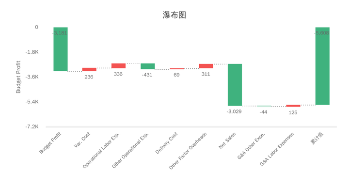
fig = go.Figure(go.Waterfall(
name = "20", orientation = "v",
measure = ["relative", "relative", "total", "relative", "relative", "total"],
x = ["Sales", "Consulting", "Net revenue", "Purchases", "Other expenses", "Profit before tax"],
textposition = "outside",
text = ["+60", "+80", "", "-40", "-20", "Total"],
y = [60, 80, 0, -40, -20, 0],
connector = {"line":{"color":"rgb(63, 63, 63)"}},
))
fig.update_layout(
title = "Profit and loss statement 2018",
showlegend = True
)
fig.show()
Plotly 绘制科学图表

Plotly绘制三元轮廓图
三元图是重心图的一种,它有三个变量,但需要三者总和为恒定值。在一个等边三角形坐标系中,图中某一点的位置代表三个变量间的比例关系。
常用于物理化学、 岩石学、矿物学、冶金学和其它物理科学,用于表示在同一个系统中三组分间的比例。
三元轮廓图表示在三元图内定义的量的等值线,三元图的坐标通常对应于三种物质的浓度,轮廓表示的数量是随成分变化的某些属性(例如,物理,化学,热力学)。

contour_raw_data = pd.read_json('../data/contour_data.json')
contour_dict = contour_raw_data['Data']
def clean_data(data_in):
"""
Cleans data in a format which can be conveniently
used for drawing traces. Takes a dictionary as the
input, and returns a list in the following format:
input = {'key': ['a b c']}
output = [key, [a, b, c]]
"""
key = list(data_in.keys())[0]
data_out = [key]
for i in data_in[key]:
data_out.append(list(map(float, i.split(' '))))
return data_out
# Defining a colormap:
colors = ['#8dd3c7','#ffffb3','#bebada',
'#fb8072','#80b1d3','#fdb462',
'#b3de69','#fccde5','#d9d9d9',
'#bc80bd']
colors_iterator = iter(colors)
fig = go.Figure()
for raw_data in contour_dict:
data = clean_data(raw_data)
a = [inner_data[0] for inner_data in data[1:]]
a.append(data[1][0]) # Closing the loop
b = [inner_data[1] for inner_data in data[1:]]
b.append(data[1][1]) # Closing the loop
c = [inner_data[2] for inner_data in data[1:]]
c.append(data[1][2]) # Closing the loop
fig.add_trace(go.Scatterternary(
text = data[0],
a=a, b=b, c=c, mode='lines',
line=dict(color='#444', shape='spline'),
fill='toself',
fillcolor = colors_iterator.__next__()
))
fig.update_layout(title = 'Ternary Contour Plot')
fig.show()
Plotly绘制地图

Plotly绘制气泡图
df = pd.read_csv("../data/covid19-06-28-2020.csv")
df.head().T
| 0 | 1 | 2 | 3 | 4 | |
|---|---|---|---|---|---|
| FIPS | 45001 | 22001 | 51001 | 16001 | 19001 |
| Admin2 | Abbeville | Acadia | Accomack | Ada | Adair |
| Province_State | South Carolina | Louisiana | Virginia | Idaho | Iowa |
| Country_Region | US | US | US | US | US |
| Last_Update | 2020-06-29 04:33:44 | 2020-06-29 04:33:44 | 2020-06-29 04:33:44 | 2020-06-29 04:33:44 | 2020-06-29 04:33:44 |
| Lat | 34.2233 | 30.2951 | 37.7671 | 43.4527 | 41.3308 |
| Long_ | -82.4617 | -92.4142 | -75.6323 | -116.242 | -94.4711 |
| Confirmed | 103 | 812 | 1039 | 1841 | 15 |
| Deaths | 0 | 36 | 14 | 23 | 0 |
| Recovered | 0 | 0 | 0 | 0 | 0 |
| Active | 103 | 776 | 1025 | 1818 | 15 |
| Combined_Key | Abbeville, South Carolina, US | Acadia, Louisiana, US | Accomack, Virginia, US | Ada, Idaho, US | Adair, Iowa, US |
| Incidence_Rate | 419.945 | 1308.73 | 3215.13 | 382.278 | 209.732 |
| Case-Fatality_Ratio | 0 | 4.4335 | 1.34745 | 1.24932 | 0 |
mean = df['Confirmed'].mean()
normlised_data_C = [np.sqrt(value/df['Confirmed'].mean())+5 for value in df['Confirmed']]
hoverdata1 = df['Combined_Key'] + " - "+ ['Confirmed cases: ' + str(v) for v in df['Confirmed'].tolist()]
fig = go.Figure(data=go.Scattergeo(
lon = df['Long_'],
lat = df['Lat'],
name = 'Confirmed cases',
hovertext = hoverdata1,
marker = dict(
size = normlised_data_C,
opacity = 0.5,
color = 'blue',
line = dict(
width=0,
color='rgba(102, 102, 102)'
),
),
))
fig.update_layout(
title = 'The global impact of COVID-19',
legend=dict(
itemsizing = "constant",
font=dict(
family="sans-serif",
size=20,
color="black"
)
)
)
fig.show()
Plotly绘制分组统计图
df_cr = df.groupby('Country_Region').sum()
df_cr.reset_index(inplace=True)
df_cr.head(4).T
| 0 | 1 | 2 | 3 | |
|---|---|---|---|---|
| Country_Region | Afghanistan | Albania | Algeria | Andorra |
| FIPS | 0 | 0 | 0 | 0 |
| Lat | 33.9391 | 41.1533 | 28.0339 | 42.5063 |
| Long_ | 67.71 | 20.1683 | 1.6596 | 1.5218 |
| Confirmed | 30967 | 2402 | 13273 | 855 |
| Deaths | 721 | 55 | 897 | 52 |
| Recovered | 12604 | 1384 | 9371 | 799 |
| Active | 17642 | 963 | 3005 | 4 |
| Incidence_Rate | 79.5487 | 83.4665 | 30.2684 | 1106.58 |
| Case-Fatality_Ratio | 2.32828 | 2.28976 | 6.75808 | 6.08187 |
fig = go.Figure(data=go.Choropleth(
locationmode = 'country names',
locations = df_cr['Country_Region'],
z = df_cr['Confirmed'],
text = df_cr['Country_Region'],
colorscale = 'Oranges',
autocolorscale=False,
marker_line_color='darkgray',
marker_line_width=0.5,
colorbar_title = 'Conifrmed',
))
fig.update_layout(
title_text='Covid19 Confirmed Cases 06-28-2020',
geo=dict(
showframe=False,
showcoastlines=False,
projection_type='equirectangular'
),
annotations = [dict(
x=0.55,
y=0.0,
xref='paper',
yref='paper',
text='Source: <a href="https://github.com/CSSEGISandData/COVID-19">\
CSSEGISandData/COVID-19</a>',
showarrow = False
)]
)
fig
Plotly绘制3D图表

Plotly 绘制3D地形图
# Read data from a csv
z_data = pd.read_csv('../data/mt_bruno_elevation.csv')
fig = go.Figure(data=[go.Surface(z=z_data.values)])
fig.update_layout(title='Mt Bruno Elevation',
margin=dict(l=15, r=15, b=15, t=50))
fig.show()
Plotly绘制混合子图
- 使用
plotly.subplots.make_subplots()函数 - 可以将不同类型的子图集成在同一张图中
- 不同的子图之间可以进行联动
from plotly.subplots import make_subplots
# read in volcano database data
df = pd.read_csv(
"../data/volcano_db.csv",
encoding="iso-8859-1",
)
# frequency of Country
freq = df
freq = freq.Country.value_counts().reset_index().rename(columns={"index": "x"})
# read in 3d volcano surface data
df_v = pd.read_csv("../data/volcano.csv")
# Initialize figure with subplots
fig = make_subplots(
rows=2, cols=2,
column_widths=[0.6, 0.4],
row_heights=[0.4, 0.6],
specs=[[{"type": "scattergeo", "rowspan": 2}, {"type": "bar"}],
[ None , {"type": "surface"}]])
# Add scattergeo globe map of volcano locations
fig.add_trace(
go.Scattergeo(lat=df["Latitude"],
lon=df["Longitude"],
mode="markers",
hoverinfo="text",
showlegend=False,
marker=dict(color="crimson", size=4, opacity=0.8)),
row=1, col=1
)
# Add locations bar chart
fig.add_trace(
go.Bar(x=freq["x"][0:10],y=freq["Country"][0:10], marker=dict(color="crimson"), showlegend=False),
row=1, col=2
)
# Add 3d surface of volcano
fig.add_trace(
go.Surface(z=df_v.values.tolist(), showscale=False),
row=2, col=2
)
# Update geo subplot properties
fig.update_geos(
projection_type="orthographic",
landcolor="white",
oceancolor="MidnightBlue",
showocean=True,
lakecolor="LightBlue"
)
# Rotate x-axis labels
fig.update_xaxes(tickangle=45)
# Set theme, margin, and annotation in layout
fig.update_layout(
template="plotly_dark",
width=800,
height=600,
margin=dict(r=10, t=25, b=40, l=60),
annotations=[
dict(
text="Source: NOAA",
showarrow=False,
xref="paper",
yref="paper",
x=0,
y=0)
]
)
fig.show()
fig = make_subplots(rows=2, cols=2,
specs=[[{"type": "xy"}, {"type": "polar"}],
[{"type": "domain"}, {"type": "scene"}]])
fig.add_bar(row=1, col=1, y=[2, 3, 1], )
fig.add_pie(row=2, col=1, values=[2, 3, 1])
fig.add_barpolar(row=1, col=2, theta=[0, 45, 90], r=[2, 3, 1])
fig.add_scatter3d(row=2, col=2, x=[2, 3], y=[0, 0], z=[0.5, 1])
fig.update_layout(height=700, showlegend=False)
fig.show()
定制化控件
Plotly可以在图上添加定制化的控件,用以控制图表的内容呈现:
- 自定义按钮
- 滑块
- 下拉菜单
- 范围滑块和选择器
# Generate dataset
import numpy as np
np.random.seed(1)
x0 = np.random.normal(2, 0.4, 400)
y0 = np.random.normal(2, 0.4, 400)
x1 = np.random.normal(3, 0.6, 600)
y1 = np.random.normal(6, 0.4, 400)
x2 = np.random.normal(4, 0.2, 200)
y2 = np.random.normal(4, 0.4, 200)
# Create figure
fig = go.Figure()
# Add traces
fig.add_trace(
go.Scatter(
x=x0,
y=y0,
mode="markers",
marker=dict(color="DarkOrange")
)
)
fig.add_trace(
go.Scatter(
x=x1,
y=y1,
mode="markers",
marker=dict(color="Crimson")
)
)
fig.add_trace(
go.Scatter(
x=x2,
y=y2,
mode="markers",
marker=dict(color="RebeccaPurple")
)
)
# Add buttons that add shapes
cluster0 = [dict(type="circle",
xref="x", yref="y",
x0=min(x0), y0=min(y0),
x1=max(x0), y1=max(y0),
line=dict(color="DarkOrange"))]
cluster1 = [dict(type="circle",
xref="x", yref="y",
x0=min(x1), y0=min(y1),
x1=max(x1), y1=max(y1),
line=dict(color="Crimson"))]
cluster2 = [dict(type="circle",
xref="x", yref="y",
x0=min(x2), y0=min(y2),
x1=max(x2), y1=max(y2),
line=dict(color="RebeccaPurple"))]
fig.update_layout(
updatemenus=[
dict(buttons=list([
dict(label="None",
method="relayout",
args=["shapes", []]),
dict(label="Cluster 0",
method="relayout",
args=["shapes", cluster0]),
dict(label="Cluster 1",
method="relayout",
args=["shapes", cluster1]),
dict(label="Cluster 2",
method="relayout",
args=["shapes", cluster2]),
dict(label="All",
method="relayout",
args=["shapes", cluster0 + cluster1 + cluster2])
]),
)
]
)
# Update remaining layout properties
fig.update_layout(
title_text="Highlight Clusters",
showlegend=False,
)
fig.show()
Plotly Express介绍
Plotly Express是Plotly开发团队为解决Plotly.py语法繁琐推出的高级可视化库。
- 对
Plotly.py的高级封装 - 自4.0开始,已整合为plotly一部分
- 为复杂的图表提供了一个简单的语法
- 具有简洁,一致且易于学习的 API
- 与Plotly生态的其他部分良好兼容
Plotly Express使用
- 一次导入所有模块,
import plotly_express as px - 大多数绘图只需要一个函数调用
- 接受一个整洁的Pandas dataframe作为输入
- 内置大量实用、现代的绘图模板,快速生成图表
- 输出ExpressFigure继承自 Plotly.py 的 Figure 类
Plotly Express图表说明
- 基本图表:
scatter,line,area,bar,funnel - 比例图表(Part-of-Whole):
pie,sunburst,treemap,funnel_area - 1维随机分布:
histogram,box,violin,strip - 2维随机分布:
density_heatmap,density_contour - 2D图像:
imshow - 3D立体图
scatter_3d,line_3d - 多维统计图表:
scatter_matrix,parallel_coordinates,parallel_categories - 平铺地图:
scatter_mapbox,line_mapbox,choropleth_mapbox,density_mapbox - 轮廓图:
scatter_geo,line_geo,choropleth - 极坐标图:
scatter_polar,line_polar,bar_polar - 三元图:
scatter_ternary,line_ternary
Plotly Express绘制统计图表
import plotly.express as px
df = px.data.iris()
fig = px.scatter(df, x="sepal_width", y="sepal_length", color="species", marginal_y="violin",
marginal_x="box", trendline="ols", template="simple_white")
fig.update_layout(
width=900,
height=600)
fig.show()
Plotly绘制矩形树图
df_cr["world"] = "world" # in order to have a single root node
df_cr["Case-Fatality_Ratio"] = df_cr["Deaths"]/df_cr['Confirmed']*100
fig = px.treemap(df_cr, path=['world', 'Country_Region'], values='Confirmed',
color='Case-Fatality_Ratio',
color_continuous_scale='Blues',range_color=[0,df_cr['Case-Fatality_Ratio'].max()],
)
fig.show()
Plotly Express绘制动画
df = px.data.gapminder()
px.scatter(df, x="gdpPercap", y="lifeExp", animation_frame="year", animation_group="country",
size="pop", color="continent", hover_name="country",
log_x=True, size_max=55, range_x=[100,100000], range_y=[25,90])
Cufflinks介绍
pandas like visualization
Cufflinks是结合Pandas对Plotly进行封装的第三方库
- 将所有的绘图方法都封装到了 iplot() 方法
- 可以结合pandas的dataframe随意灵活地画图
Cufflinks使用示例
import pandas as pd
import cufflinks as cf
import numpy as np
print(cf.__version__)
# 使用离线模式
cf.set_config_file(world_readable=True,
theme='pearl',
offline=True)
0.17.3
# 随机生成bar 条形图
df1=pd.DataFrame(np.random.rand(12, 4), columns=['a', 'b', 'c', 'd'])
df1.iplot(kind='bar',barmode='stack')
# 随机生成histogram直方图
cf.datagen.histogram(3).iplot(kind='histogram')
#随机scatter matrix 散点矩阵图
df2 = pd.DataFrame(np.random.randn(1000, 4), columns=['a', 'b', 'c', 'd'])
df2.scatter_matrix()
# 随机数绘图,'DataFrame' object has no attribute 'lines'
cf.datagen.lines(1,2000).ta_plot(study='sma',periods=[13,21,55])
# 1)cufflinks使用datagen生成随机数;
# 2)figure定义为lines形式,数据为(1,2000);
# 3)然后再用ta_plot绘制这一组时间序列,参数设置SMA展现三个不同周期的时序分析。
#随机subplots 子图
df3=cf.datagen.lines(4)
df3.iplot(subplots=True,shape=(4,1),shared_xaxes=True,vertical_spacing=.02,fill=True)
Plotly图表导出
- 导出html
- 导出div
- 导出静态图片
导出html
使用
write_html
import plotly.express as px
fig =px.scatter(x=range(10), y=range(10))
fig.write_html("./plotly_fig.html")
from IPython.display import IFrame
IFrame(src="./plotly_fig.html", width=810, height=520)
import plotly.io as pio
import plotly.graph_objects as go
fig = go.Figure()
pio.to_html(fig, include_plotlyjs='cdn', full_html=False)
'<div>\n \n <script type="text/javascript">window.PlotlyConfig = {MathJaxConfig: \'local\'};</script>\n <script src="https://cdn.plot.ly/plotly-latest.min.js"></script> \n <div id="e6c6f1f3-e815-4bc8-86e2-c8ac466f4d1c" class="plotly-graph-div" style="height:600px; width:800px;"></div>\n <script type="text/javascript">\n \n window.PLOTLYENV=window.PLOTLYENV || {};\n \n if (document.getElementById("e6c6f1f3-e815-4bc8-86e2-c8ac466f4d1c")) {\n Plotly.newPlot(\n \'e6c6f1f3-e815-4bc8-86e2-c8ac466f4d1c\',\n [],\n {"template": {"data": {"bar": [{"error_x": {"color": "#2a3f5f"}, "error_y": {"color": "#2a3f5f"}, "marker": {"line": {"color": "#E5ECF6", "width": 0.5}}, "type": "bar"}], "barpolar": [{"marker": {"line": {"color": "#E5ECF6", "width": 0.5}}, "type": "barpolar"}], "carpet": [{"aaxis": {"endlinecolor": "#2a3f5f", "gridcolor": "white", "linecolor": "white", "minorgridcolor": "white", "startlinecolor": "#2a3f5f"}, "baxis": {"endlinecolor": "#2a3f5f", "gridcolor": "white", "linecolor": "white", "minorgridcolor": "white", "startlinecolor": "#2a3f5f"}, "type": "carpet"}], "choropleth": [{"colorbar": {"outlinewidth": 0, "ticks": ""}, "type": "choropleth"}], "contour": [{"colorbar": {"outlinewidth": 0, "ticks": ""}, "colorscale": [[0.0, "#0d0887"], [0.1111111111111111, "#46039f"], [0.2222222222222222, "#7201a8"], [0.3333333333333333, "#9c179e"], [0.4444444444444444, "#bd3786"], [0.5555555555555556, "#d8576b"], [0.6666666666666666, "#ed7953"], [0.7777777777777778, "#fb9f3a"], [0.8888888888888888, "#fdca26"], [1.0, "#f0f921"]], "type": "contour"}], "contourcarpet": [{"colorbar": {"outlinewidth": 0, "ticks": ""}, "type": "contourcarpet"}], "heatmap": [{"colorbar": {"outlinewidth": 0, "ticks": ""}, "colorscale": [[0.0, "#0d0887"], [0.1111111111111111, "#46039f"], [0.2222222222222222, "#7201a8"], [0.3333333333333333, "#9c179e"], [0.4444444444444444, "#bd3786"], [0.5555555555555556, "#d8576b"], [0.6666666666666666, "#ed7953"], [0.7777777777777778, "#fb9f3a"], [0.8888888888888888, "#fdca26"], [1.0, "#f0f921"]], "type": "heatmap"}], "heatmapgl": [{"colorbar": {"outlinewidth": 0, "ticks": ""}, "colorscale": [[0.0, "#0d0887"], [0.1111111111111111, "#46039f"], [0.2222222222222222, "#7201a8"], [0.3333333333333333, "#9c179e"], [0.4444444444444444, "#bd3786"], [0.5555555555555556, "#d8576b"], [0.6666666666666666, "#ed7953"], [0.7777777777777778, "#fb9f3a"], [0.8888888888888888, "#fdca26"], [1.0, "#f0f921"]], "type": "heatmapgl"}], "histogram": [{"marker": {"colorbar": {"outlinewidth": 0, "ticks": ""}}, "type": "histogram"}], "histogram2d": [{"colorbar": {"outlinewidth": 0, "ticks": ""}, "colorscale": [[0.0, "#0d0887"], [0.1111111111111111, "#46039f"], [0.2222222222222222, "#7201a8"], [0.3333333333333333, "#9c179e"], [0.4444444444444444, "#bd3786"], [0.5555555555555556, "#d8576b"], [0.6666666666666666, "#ed7953"], [0.7777777777777778, "#fb9f3a"], [0.8888888888888888, "#fdca26"], [1.0, "#f0f921"]], "type": "histogram2d"}], "histogram2dcontour": [{"colorbar": {"outlinewidth": 0, "ticks": ""}, "colorscale": [[0.0, "#0d0887"], [0.1111111111111111, "#46039f"], [0.2222222222222222, "#7201a8"], [0.3333333333333333, "#9c179e"], [0.4444444444444444, "#bd3786"], [0.5555555555555556, "#d8576b"], [0.6666666666666666, "#ed7953"], [0.7777777777777778, "#fb9f3a"], [0.8888888888888888, "#fdca26"], [1.0, "#f0f921"]], "type": "histogram2dcontour"}], "mesh3d": [{"colorbar": {"outlinewidth": 0, "ticks": ""}, "type": "mesh3d"}], "parcoords": [{"line": {"colorbar": {"outlinewidth": 0, "ticks": ""}}, "type": "parcoords"}], "pie": [{"automargin": true, "type": "pie"}], "scatter": [{"marker": {"colorbar": {"outlinewidth": 0, "ticks": ""}}, "type": "scatter"}], "scatter3d": [{"line": {"colorbar": {"outlinewidth": 0, "ticks": ""}}, "marker": {"colorbar": {"outlinewidth": 0, "ticks": ""}}, "type": "scatter3d"}], "scattercarpet": [{"marker": {"colorbar": {"outlinewidth": 0, "ticks": ""}}, "type": "scattercarpet"}], "scattergeo": [{"marker": {"colorbar": {"outlinewidth": 0, "ticks": ""}}, "type": "scattergeo"}], "scattergl": [{"marker": {"colorbar": {"outlinewidth": 0, "ticks": ""}}, "type": "scattergl"}], "scattermapbox": [{"marker": {"colorbar": {"outlinewidth": 0, "ticks": ""}}, "type": "scattermapbox"}], "scatterpolar": [{"marker": {"colorbar": {"outlinewidth": 0, "ticks": ""}}, "type": "scatterpolar"}], "scatterpolargl": [{"marker": {"colorbar": {"outlinewidth": 0, "ticks": ""}}, "type": "scatterpolargl"}], "scatterternary": [{"marker": {"colorbar": {"outlinewidth": 0, "ticks": ""}}, "type": "scatterternary"}], "surface": [{"colorbar": {"outlinewidth": 0, "ticks": ""}, "colorscale": [[0.0, "#0d0887"], [0.1111111111111111, "#46039f"], [0.2222222222222222, "#7201a8"], [0.3333333333333333, "#9c179e"], [0.4444444444444444, "#bd3786"], [0.5555555555555556, "#d8576b"], [0.6666666666666666, "#ed7953"], [0.7777777777777778, "#fb9f3a"], [0.8888888888888888, "#fdca26"], [1.0, "#f0f921"]], "type": "surface"}], "table": [{"cells": {"fill": {"color": "#EBF0F8"}, "line": {"color": "white"}}, "header": {"fill": {"color": "#C8D4E3"}, "line": {"color": "white"}}, "type": "table"}]}, "layout": {"annotationdefaults": {"arrowcolor": "#2a3f5f", "arrowhead": 0, "arrowwidth": 1}, "coloraxis": {"colorbar": {"outlinewidth": 0, "ticks": ""}}, "colorscale": {"diverging": [[0, "#8e0152"], [0.1, "#c51b7d"], [0.2, "#de77ae"], [0.3, "#f1b6da"], [0.4, "#fde0ef"], [0.5, "#f7f7f7"], [0.6, "#e6f5d0"], [0.7, "#b8e186"], [0.8, "#7fbc41"], [0.9, "#4d9221"], [1, "#276419"]], "sequential": [[0.0, "#0d0887"], [0.1111111111111111, "#46039f"], [0.2222222222222222, "#7201a8"], [0.3333333333333333, "#9c179e"], [0.4444444444444444, "#bd3786"], [0.5555555555555556, "#d8576b"], [0.6666666666666666, "#ed7953"], [0.7777777777777778, "#fb9f3a"], [0.8888888888888888, "#fdca26"], [1.0, "#f0f921"]], "sequentialminus": [[0.0, "#0d0887"], [0.1111111111111111, "#46039f"], [0.2222222222222222, "#7201a8"], [0.3333333333333333, "#9c179e"], [0.4444444444444444, "#bd3786"], [0.5555555555555556, "#d8576b"], [0.6666666666666666, "#ed7953"], [0.7777777777777778, "#fb9f3a"], [0.8888888888888888, "#fdca26"], [1.0, "#f0f921"]]}, "colorway": ["#636efa", "#EF553B", "#00cc96", "#ab63fa", "#FFA15A", "#19d3f3", "#FF6692", "#B6E880", "#FF97FF", "#FECB52"], "font": {"color": "#2a3f5f"}, "geo": {"bgcolor": "white", "lakecolor": "white", "landcolor": "#E5ECF6", "showlakes": true, "showland": true, "subunitcolor": "white"}, "height": 600, "hoverlabel": {"align": "left"}, "hovermode": "closest", "mapbox": {"style": "light"}, "margin": {"b": 15, "l": 15, "r": 15, "t": 50}, "paper_bgcolor": "white", "plot_bgcolor": "#E5ECF6", "polar": {"angularaxis": {"gridcolor": "white", "linecolor": "white", "ticks": ""}, "bgcolor": "#E5ECF6", "radialaxis": {"gridcolor": "white", "linecolor": "white", "ticks": ""}}, "scene": {"xaxis": {"backgroundcolor": "#E5ECF6", "gridcolor": "white", "gridwidth": 2, "linecolor": "white", "showbackground": true, "ticks": "", "zerolinecolor": "white"}, "yaxis": {"backgroundcolor": "#E5ECF6", "gridcolor": "white", "gridwidth": 2, "linecolor": "white", "showbackground": true, "ticks": "", "zerolinecolor": "white"}, "zaxis": {"backgroundcolor": "#E5ECF6", "gridcolor": "white", "gridwidth": 2, "linecolor": "white", "showbackground": true, "ticks": "", "zerolinecolor": "white"}}, "shapedefaults": {"line": {"color": "#2a3f5f"}}, "ternary": {"aaxis": {"gridcolor": "white", "linecolor": "white", "ticks": ""}, "baxis": {"gridcolor": "white", "linecolor": "white", "ticks": ""}, "bgcolor": "#E5ECF6", "caxis": {"gridcolor": "white", "linecolor": "white", "ticks": ""}}, "title": {"x": 0.05}, "width": 800, "xaxis": {"automargin": true, "gridcolor": "white", "linecolor": "white", "ticks": "", "title": {"standoff": 15}, "zerolinecolor": "white", "zerolinewidth": 2}, "yaxis": {"automargin": true, "gridcolor": "white", "linecolor": "white", "ticks": "", "title": {"standoff": 15}, "zerolinecolor": "white", "zerolinewidth": 2}}}},\n {"responsive": true}\n )\n };\n \n </script>\n </div>'
# bubble气泡图
import cufflinks as cf
import pandas as pd
import numpy as np
df = pd.DataFrame(np.random.rand(50, 4), columns=['a', 'b', 'c', 'd'])
fig = df.iplot(kind='bubble',x='a',y='b',size='b',asFigure=True)
print(type(fig))
fig.write_image("plotly_bubble.png")
from IPython.display import Image
Image(filename="plotly_bubble.png")
<class 'plotly.graph_objs._figure.Figure'>

总结
- Plotly具有强大的交互式可视化能力
- Plotly生态能够满足不同方面需求
- Express 侧重于数据探索
- Cufflinks 侧重于数据呈现
- Plotly 则拥有最全的 API
使用建议:
- 探索数据中可能存在的隐藏规律 => 使用 Express
- 希望把数据漂亮地呈现出来 => 使用 Cufflinks
- 更复杂的定制化和细节实现 => 使用plotly